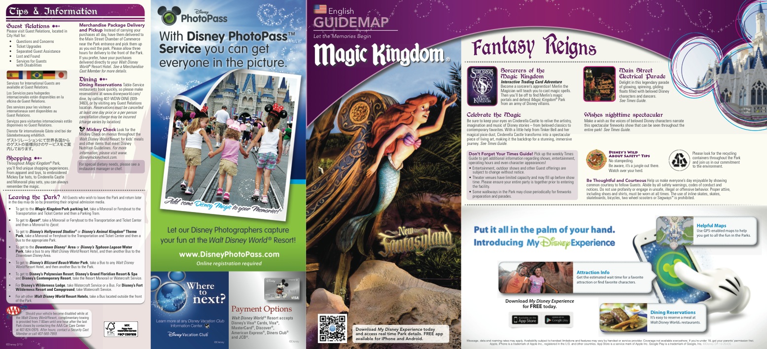
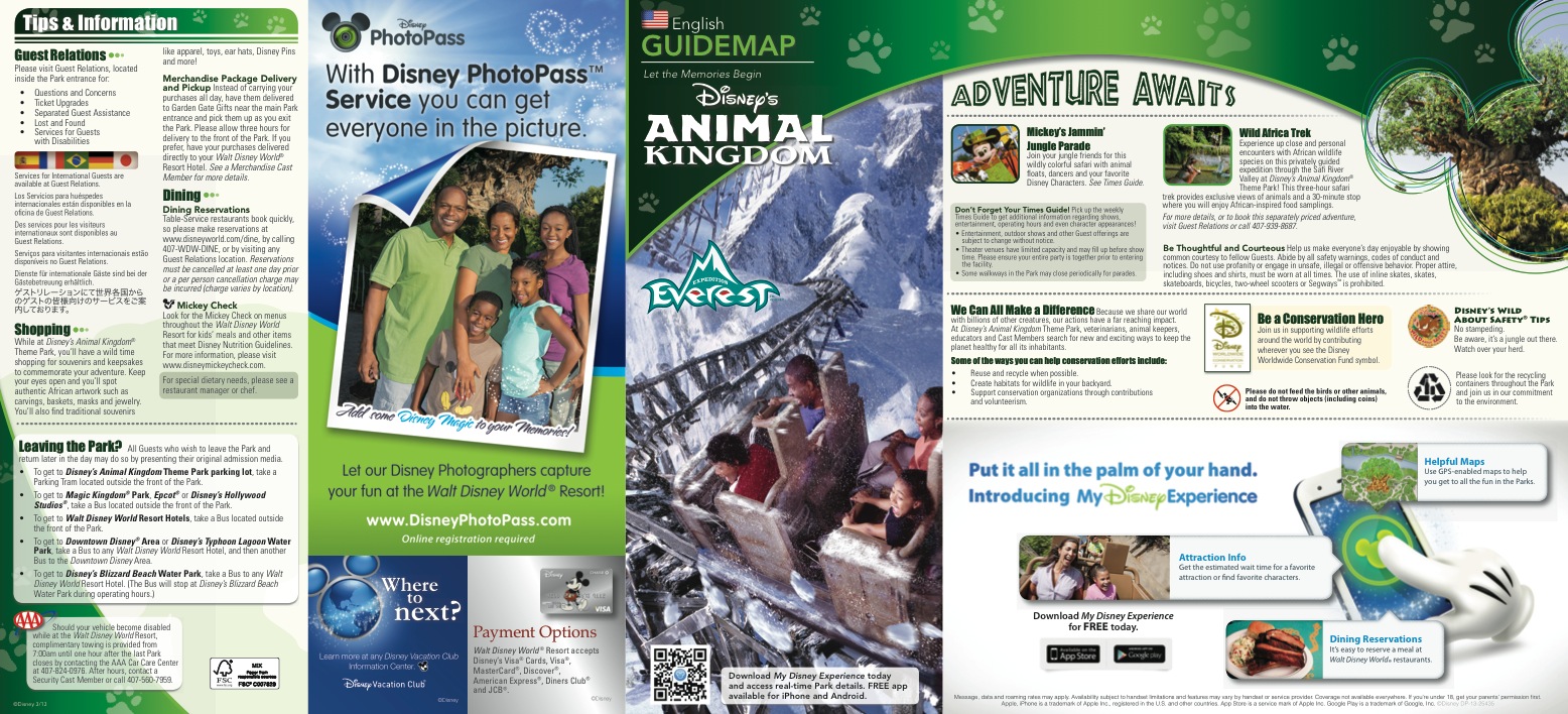
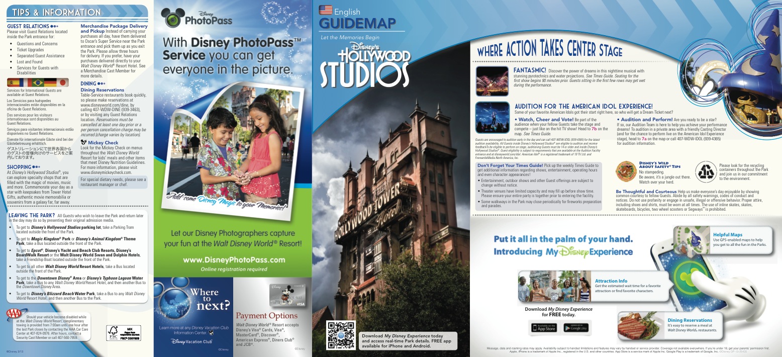
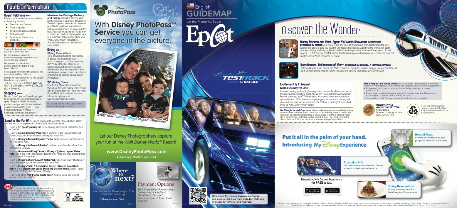
Disney park guide maps get a makeover – New design aligns with official app

All of Disney World’s theme park guide maps, plus Downtown Disney, Disney’s water parks and ESPN Wide World of Sports, are getting a new design tomorrow. The new design is meant to closely match with what guests may be used to seeing when they use the “My Disney Experience” app or Disney website to plan their vacations before their visit.
The new guides also feature a QR code, which smart phone users can scan to easily download the My Disney Experience app if they don’t already have it. The app provides updated wait and show times, an interactive map, and once launched later this year, the ability book and change FastPass+ reservations.
Other new features on the guides are:
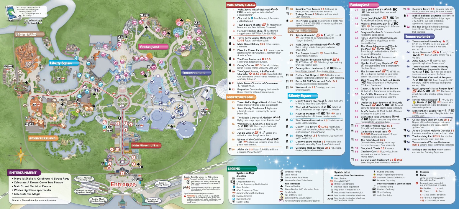
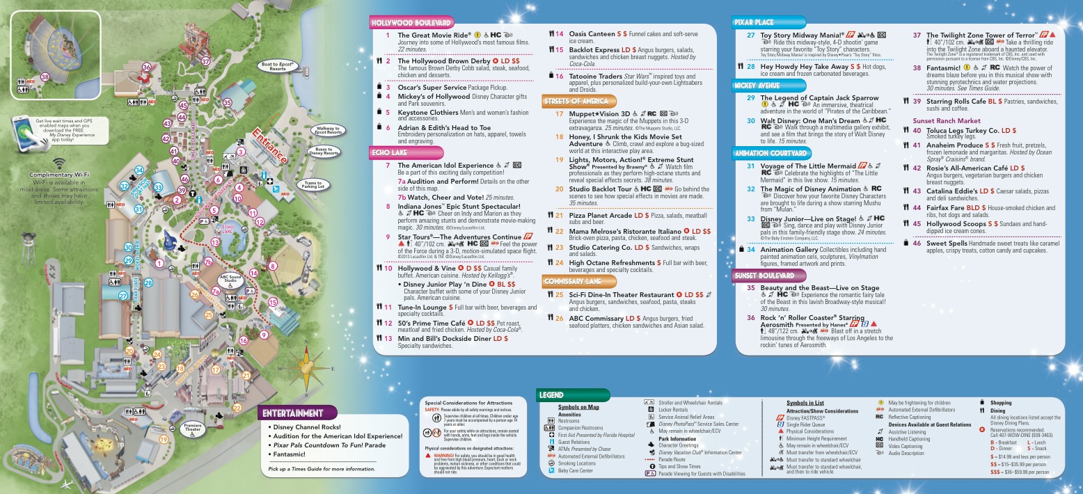
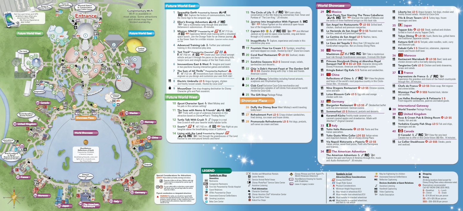
• New numbering scheme.
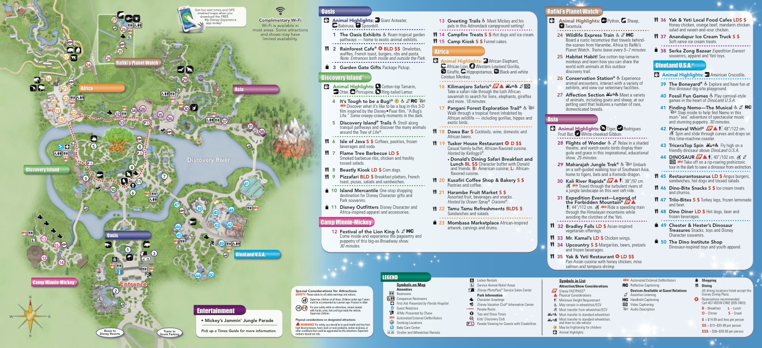
• Newly added store locations.
• Map is now drawn to scale.
• Listing of different ways to get to the other parks and WDW locations.
• New true north to south orientation.
• Animal locator added to Animal Kingdom guide.
Here’s a look at each Disney park map. Click to see them larger.
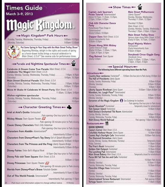
The Times Guide also has a new look:

I think the North to South orientation of the maps will help people who fire up maps in applications on phones where the orientation is likely to default to that before they orient it themselves.
It does, however, mean that the entrances are at different sides of the map (some top, some bottom, some to the side) and I think because this isn’t consistent that it will make using it slightly more difficult for first time guests.
I agree with Lee. I love the new design, but why are the entrances to the parks all over the place? Hollywood Studios is going to throw a lot of first timers off because of the new orientation. I like the new EPCOT map though, I think that’s better than the older layout.
I agree! I’m a former cast member (Guest Svcs – Yacht and Beach Clubs, Disney Rep – Swan and Dolphin) and yesterday we went to Epcot (for probably the millionth time) to see the opening day of this year’s Flower & Garden. When I opened the new map, I was like WHAT!?! It was even hard for ME to orient myself, though I obviously don’t need a map at this point. 😉 I do NOT understand the strategy of the map almost appearing “upside-down” when you first walk into the park (Hollywood Studios seems to be like this too). Also, the font size of the bulk of the map is smaller and the colors just don’t seem as vibrant as the most recent maps they used. Not really happy with these changes!
All I can say is that this will really help me out when I’m trying to figure out which part of Innoventions is “East” and “West”!
I HATE these new maps. I cannot wrap my head around Disney’s new need to embrace ALL things technology-based. I’m the type of visitor that’s irked to see everyone walking around the parks with their faces glued to their smartphones. I’m disappointed that Disney continues to cater to the technological aspect so much. What happened to magic and surprise? Later this year, the app will “help guests book their fastpasses”….REALLY?!
As a frequent visitor I really do not need the guide maps, however during my most recent visit I had to assist a number of new guests who were trying to read the maps by holding them upside down so they could orient the maps with the entrance pointing to the bottom. The new map orientation is fine for returning guests, who really do not need the map, however it makes it very difficult to the new guests who really need the maps. All in all I believe that it was a dad decision to change the map orientation on the guides.
I do enjoy Disney Parks Maps, but could they just get back to its 2D view of the map?
Love collecting Disney World Maps since 1993. I understand the logic behind the change, but entrances should be at the bottom – millions and millions and millions of guests are used to the entrances being at the bottom. Perhaps Disney can give us a choice of which map to use on the smartphone app.