Sparkling new Confectionery facade revealed on Main Street at the Magic Kingdom
By Don Gworek
Some construction walls came down this week on Main Street U.S.A. at Disney’s Magic Kingdom, revealing a bright new facade on the Confectionery shop. This is the Southeast corner of the street, at Town Square. Before examining details of the new facade, this story needs a flashback to the way the shop used to look.
 This photo was taken in February. The upper part of the construction wall has a photograph of what the facade used to look like. Much like at a modern day construction project in, say, Manhattan, guests could pass through a tunnel. Much of Main Street has been refurbished like this, a little at a time, for the past year.
 This is a profile of the Confectionery, as seen in May last year. Note the awnings and dark green which emphasize the weight of the overhang edging. Note also that the facade has stonework, a little-noticed detail.
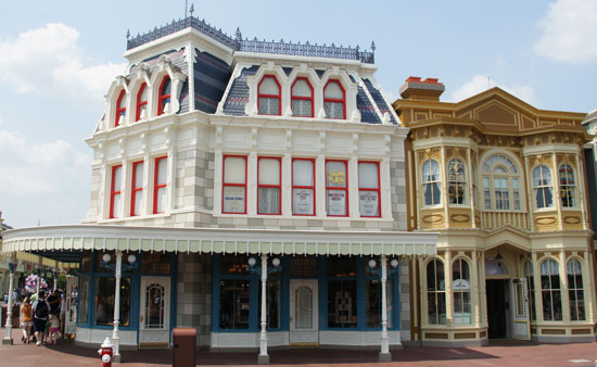 Here’s an equivalent view of the new Confectionary, as seen today. The awnings have been removed, and all the colors are much brighter. The edging of the overhang is now only shades of white, making it feel much lighter. And the weighty decorations on top of the edging have been removed, including the “Confectionery” sign. A subtle change also is a lamp post has been removed.
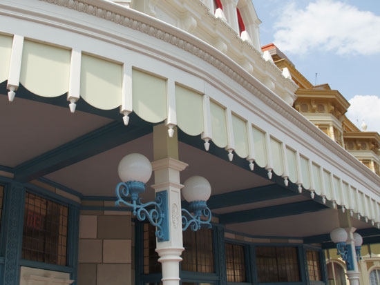 The edging now looks like it could be on a fanciful cake.
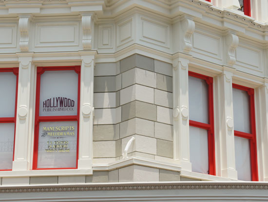
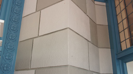 The most striking change in the new facade is the emphasis on the stone blocks. Colors alternate now. The blocks used to have uniform color.
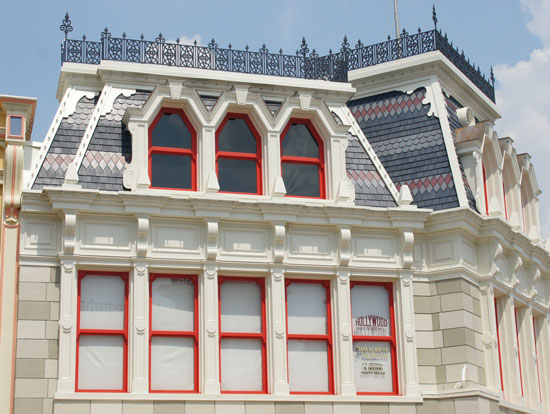 Look how many windows are available to “credits” now. One of the greatest honors you can have as a Walt Disney World cast member is to have your name listed on a window, noting your role in the success of the show.
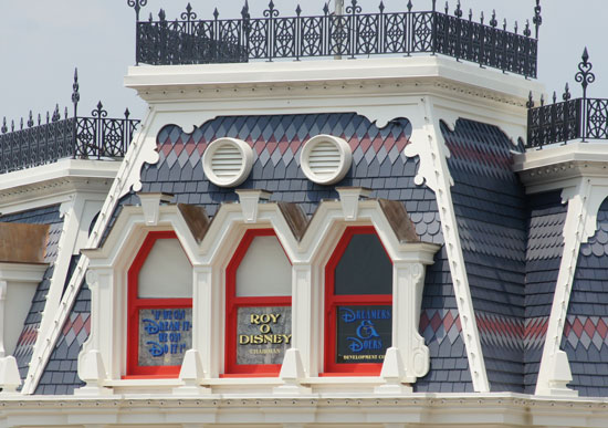 For example, this window credits Roy O. Disney, Walt’s brother. There would be no Walt Disney World today if Roy had not pursued his brother’s dream to build the resort after Walt passed away. Also note the variety in the roof shingles and the ornamental wrought iron of the roof line.
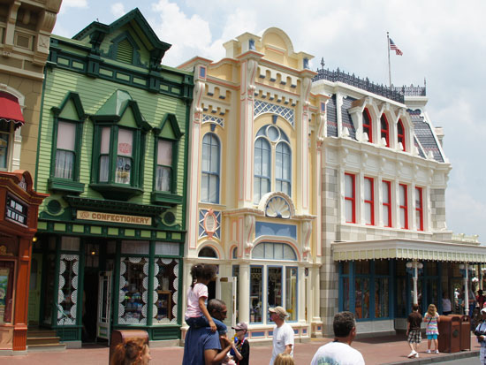 The colors of the adjacent facades have also been tweaked. When Disney Legend Marty Sklar was in Orlando for the D23 Destination D event, he also spoke at the Rosen College for Hospitality Management. In the conversation with students, he mentioned a feature of Main Street: Although all of the buildings are very different from each other, they all “talk” to each other. You can see right here how each building compliments its neighbor.
 Welcome to the Magic Kingdom family of architecture and the new Confectionery facade.
UPDATE: The Magic Kingdom is always in the “state of becoming”. It could be the photos you see here have captured some testing. It does seem odd how some windows have curtains, others have white backing, and others are clear. There could be some tweaking of the Confectionery’s appearance over the next few weeks.
Here’s a fun video about the refurbishment and the new look:
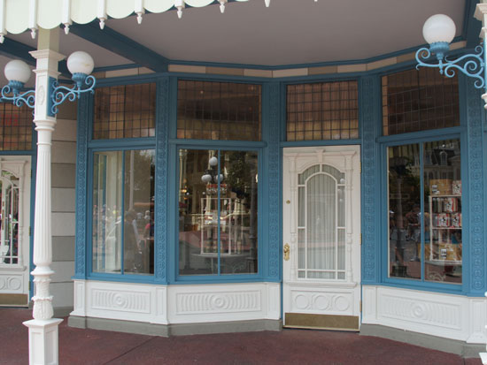
UPDATE: June 30, 2011 – Awnings have been added to the Confectionery. Here’s an updated look:
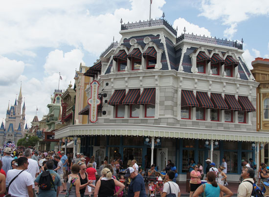


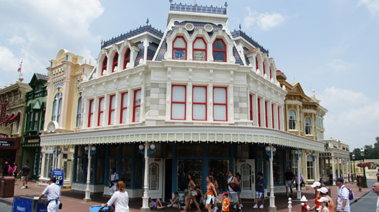
Colorwise, it looks beautiful, but I hope they will open some or all of the blinds in the upper floor windows. Right now, with all the blinds down, the building looks uninhabited.
Yep, I think you’re right. It’s curious how some windows have curtains, others have white facing, and others are clear. As if testing is being done, and things need to be seen at street level at all times of the day before decisions can be made.
That’s Walt said about Disneyland: always in the state of becoming! Things are always being tweaked and improved at Disney.
I may be in the minority, but I prefer the older look with the awnings. This new one seems to stick out too much, and I miss the awnings. Perhaps the new look will grow on me over time.
My guess is that the removal of the awnings was a maintenance budget decision. I’m sure in the wet floridan climate it’s not easy to keep them looking clean and new.
I´m with Mike, the awnings are missed and also the top of the overhang does looked bare. The whole building looks kitch with it´s coloured bricks and bright colours.
Well, I guess we’ll have to go over and see it for ourselves, but I for one, think I liked it better before. The old facade reminded me of the Lady & the Tramp period Kind of 20s Victorian period. I liked the awnings…The new colors are a little, well, a little weird…
Really jumps out! Distracts from the Castle looking down Main Street. But overall, as itself, I like it. Did they remove that horribly added bit of sidewalk?
Am I the only one who thinks it looks hideous? It makes the building look like it was made from a set of standard Legos. Sticks out like…well, pick your cliché. Sore thumb. Wart on Nose. Whatevv.
“Am I the only one who thinks it looks hideous” – definitely not, many people think (and they are right, imo) that it now looks like a mere facade (which of course it is…). I´m usually very much in favor of a slightly artificial look, WDW is not about painstakingly recreating the “real thing” – but finding the right balance between real, hyperreal and artificial is an art – and in this case, the result is not convincing.
I much rather the awnings/old style.
We like the Roy O Disney tribute but how many people spot it all the way up by the roof. You have to be accross the street and get a creak in your neck to see it. As for the shop we prefere the old one, this one takes all attention from everything else.
As soon as I saw it well… I wanted to cry. I like the old look much better!! I cosider myself a Disney tradionalist. I have always loved the way the parks are always keeping things clean and freshly painted and always looking great BUT… this is over the top. I agree with others its to much of a change!
Check the bottom of the article for an updated photo with the awnings added.
I think the archetects were fools. The original design used subtle colors so that your eye would be drawn to the castle down the block. This thing causes this side building to stick out like a sore thumb. To anyone who knows about art and archetecture, this is an utter failure. This version of the Disney Imagineers team seems really inept. If I were a large share holder I would be mad as a hornet and looking for someones butt to fire and strip of a pension. Hey wait, I am a significant share holder. Who ever did this had better start getting their resume in order. Maybe they can get a job at WalMart.
P.S. And you had better restore this building to its original design VERY soon or there may be more than one or two people looking for new jobs. I am MAD AS HELL that my company is allowing people to run around loose ruining MY park by creating such monstrosity.